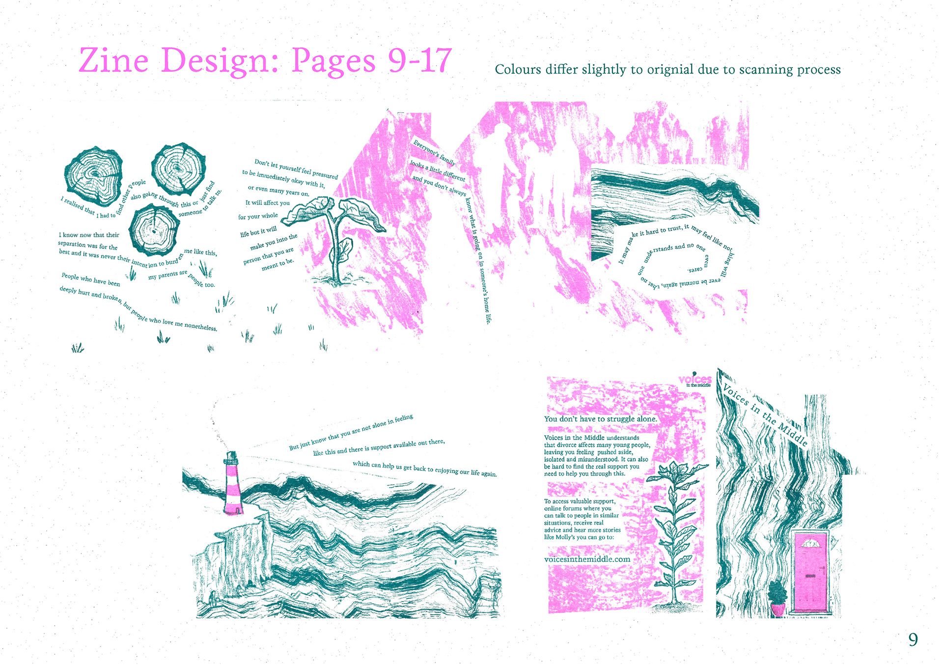
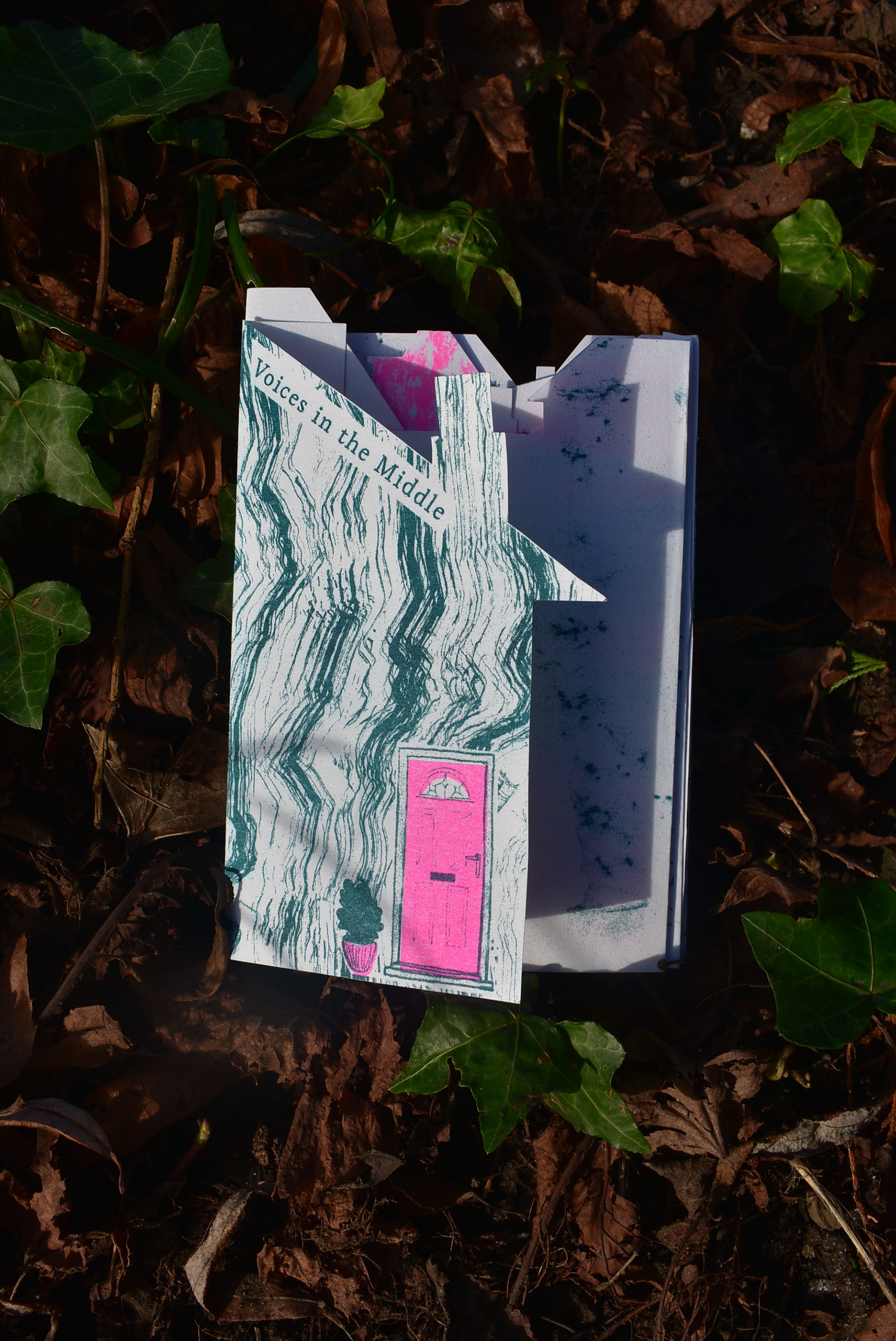
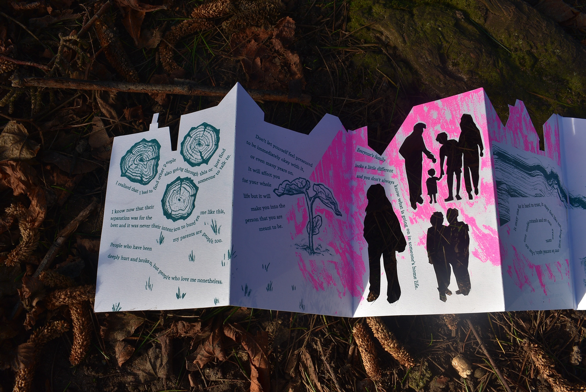
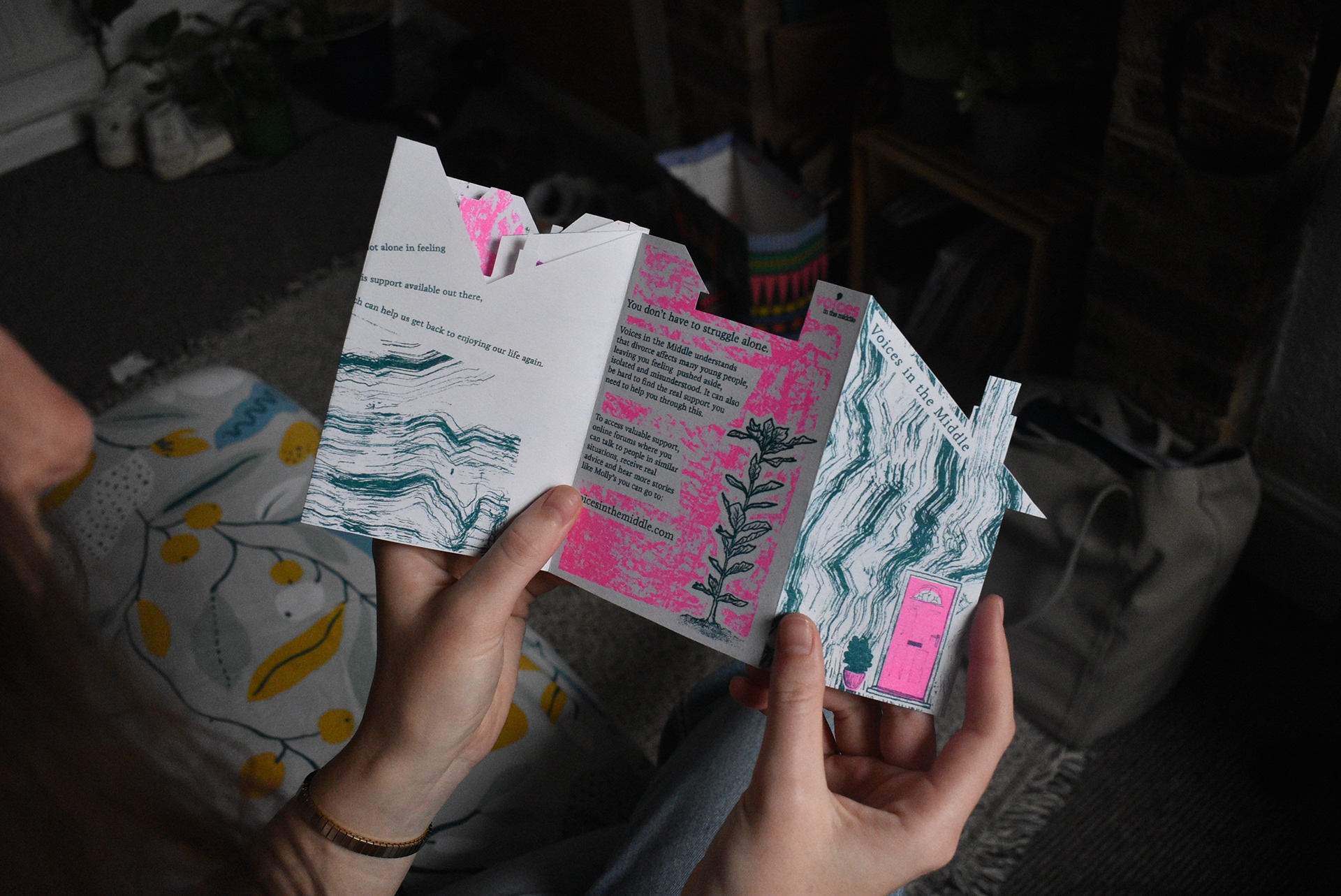
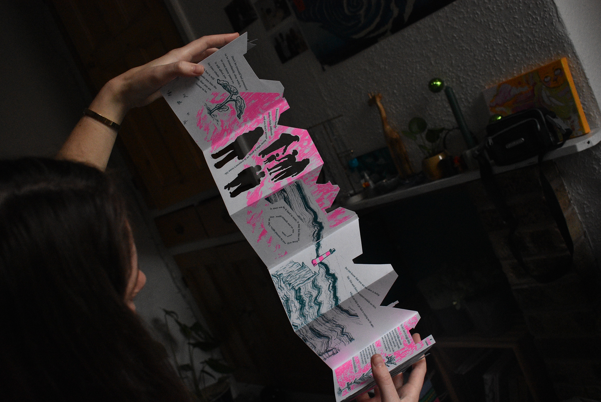
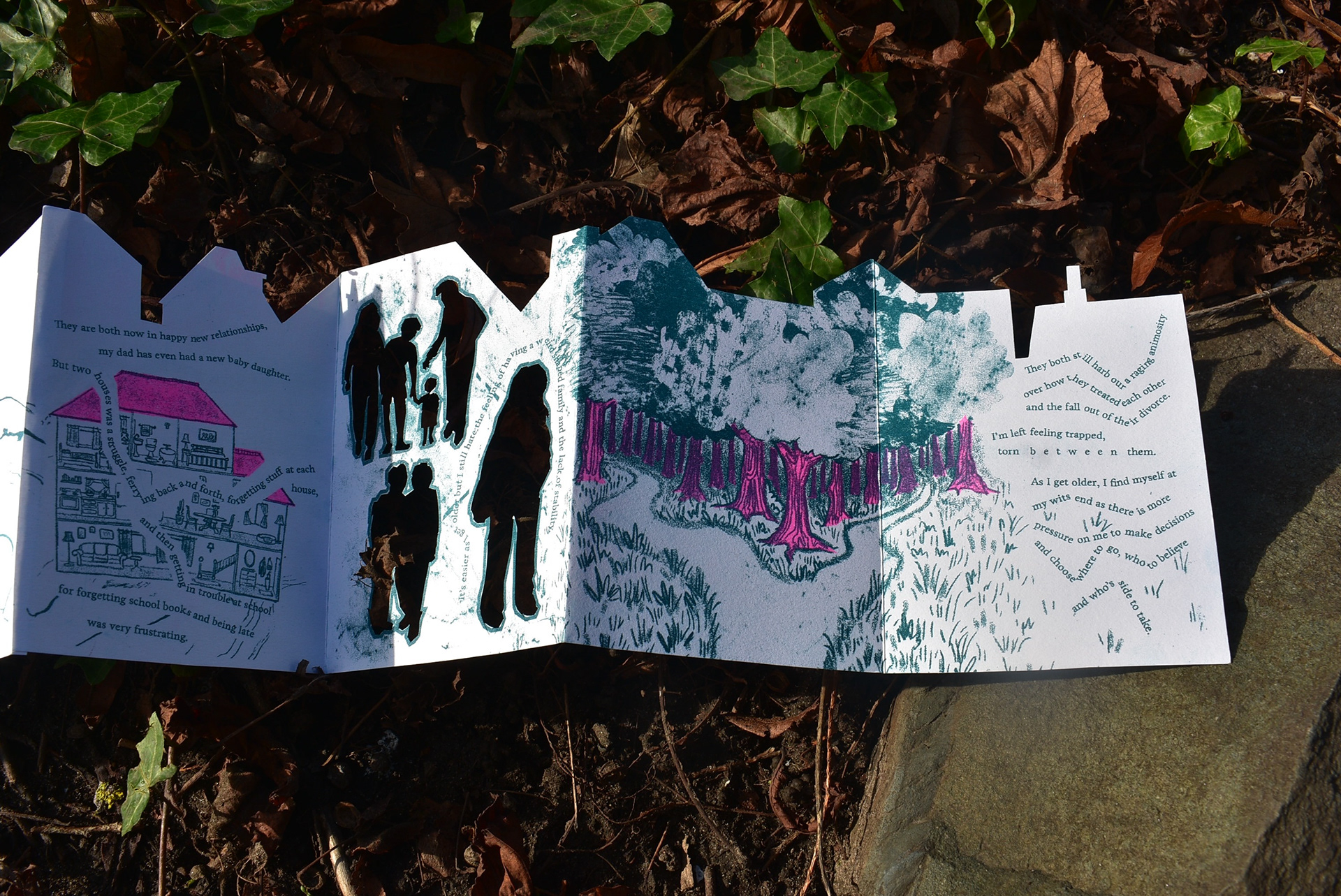
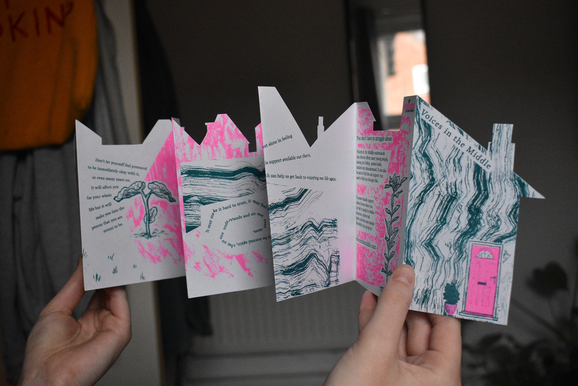
This was a final year university project where I rebooted the 'Voices in the Middle' charity. I did this in the form of a zine that tells the fictional story of a young person who has experienced divorce and how it is still affecting them as they grow up into adulthood, designed to comfort and make the reader feel understood if they can relate, or to simply educate the reader, and then offer further support through Voices in the Middle's existing services.
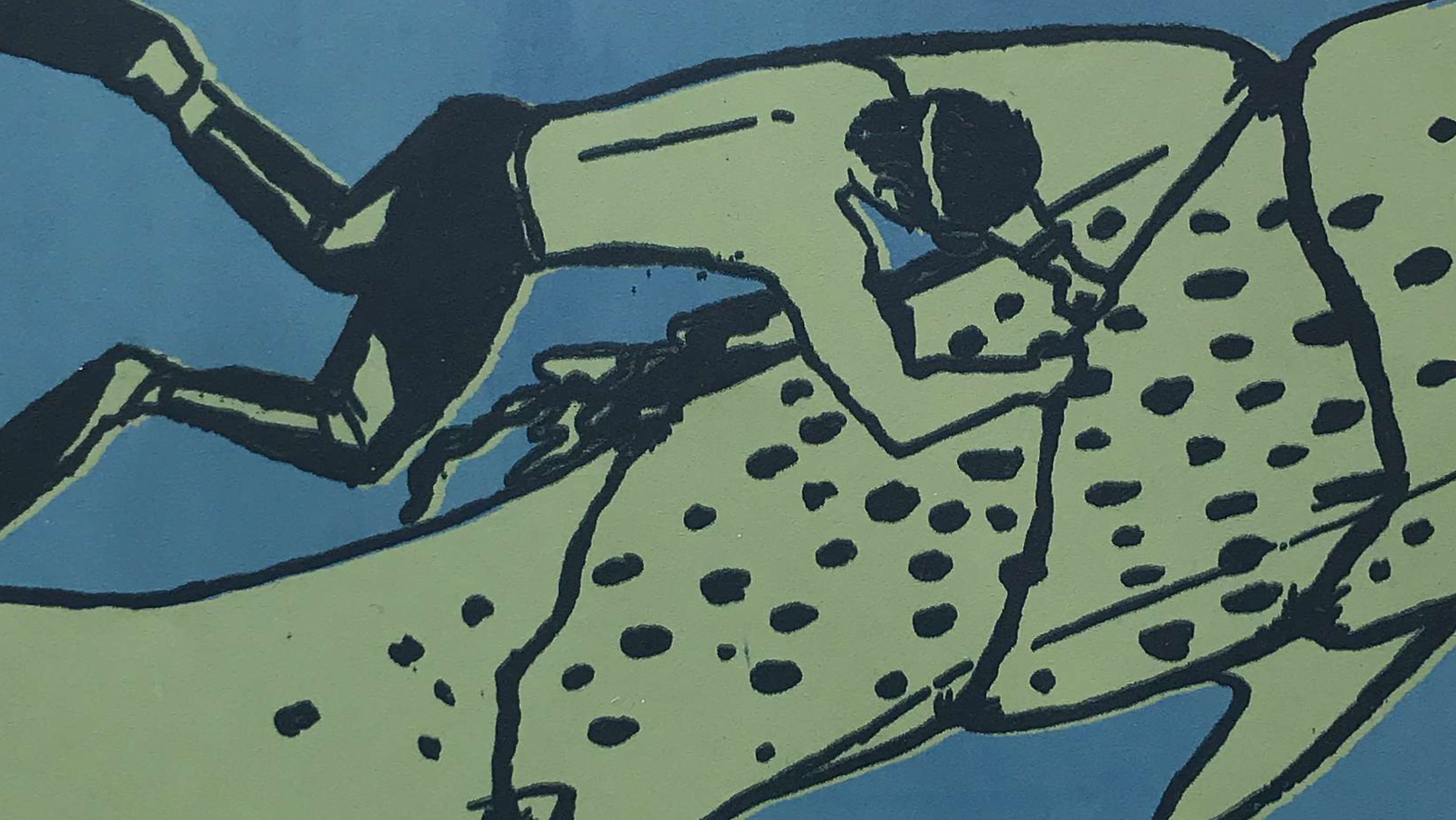
I played with disjointed type and angular shapes to emulate the challenges of a disorganised and fragmented childhood as a result of divorce. The front cover and top contour of the zine are cut into the shape of houses to symbolise home. I Riso-printed this zine using two colours, dark cyan and neon pink, and combined with rough mark-making textures, it creates bold, tactile visuals.
Video Flip-through
Presentation of the problem and my solution: